.png)
The project is focusing on revamping the company website of Una Technologies Limited to let our customers better understand our products value and start their free trail. When target customers browse our website, they don’t really understand what is the product and how can it benefit to them. Thus, I conducted user research, competitive audit, iteration design to modify layouts and visual design of the website.

- Increase content relevancy
- A delightful, consistent consumer experience
- Strengthen the value proposition of core products
- Drive customers to purchase our products
Referring to the customer chat records from marketing team, we figured out the pain point, confusion of the user and what kind of information they were hard to find on the website.

Before I started designing, I met with marketing team to get the information for our existing customers, and also the frequent customer issues that they need to be dealt with.
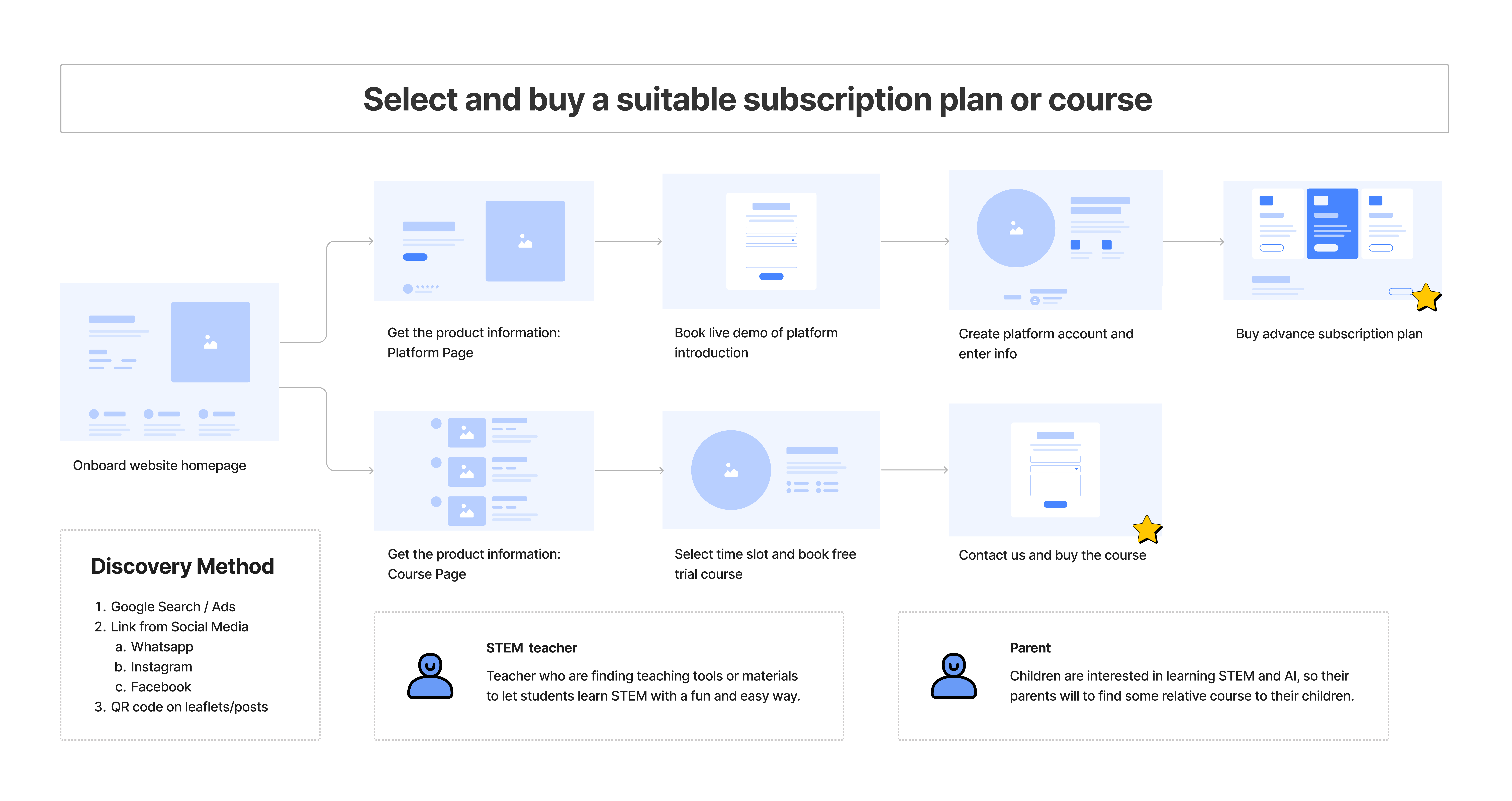
Our two main target customers are STEM teachers and the parents with children who are interested at STEM. They discover and buy our products in different ways due to their different habits, educational backgrounds and needs.
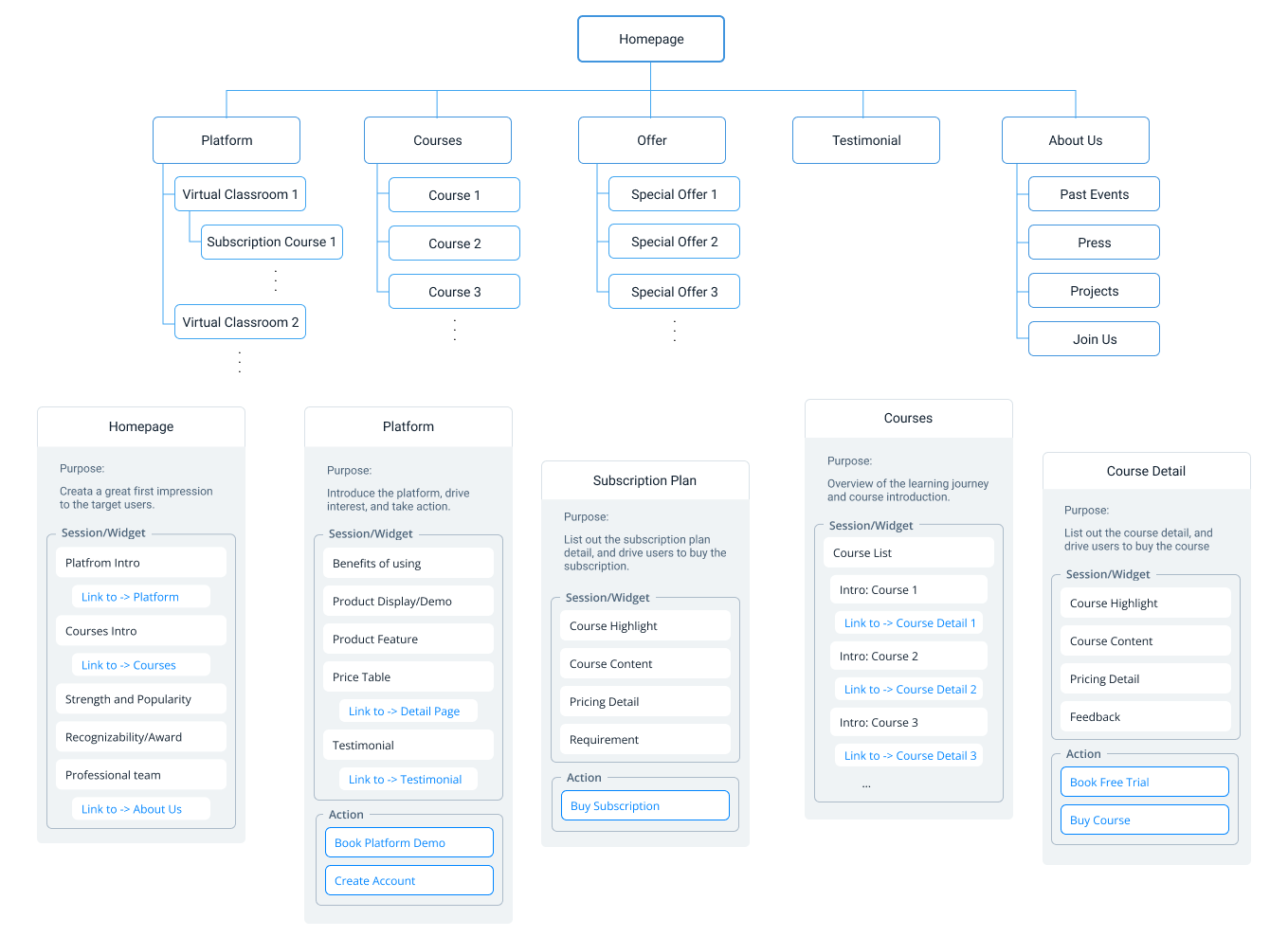
After discussing with the product manager, we listed all our products and services and figured out what kind of information we needed to provide to our customers. Then, I reorganized the menu structure of the site by categorization, and arranged which pages would be appropriate for those information.
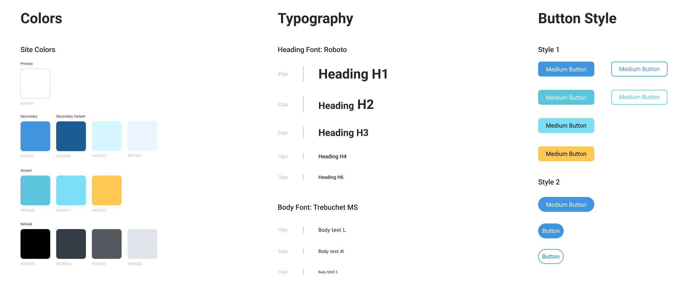
As our company is providing B2B and B2C educational service and product, showing a professional and lively image is necessary. Also, after referring some UI design guideline, I generate the following theme colour, font, button style.
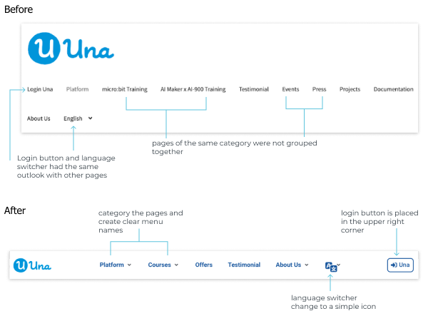
Unclear categories and lack of visual design confuse users. By referring the previous re-organised website structure and other similar website designs, we generated a new menu bar.
At the same time, in order to clearly display a large number of products, a mega menu is used to make the design more creative and the display more flexible.

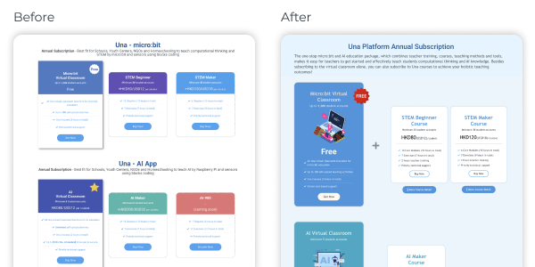
Through various styles and the motion effects, it is shown that the platform subscription is a basic core service, and the course subscription is an additional products that need to be used in conjunction with the platform.
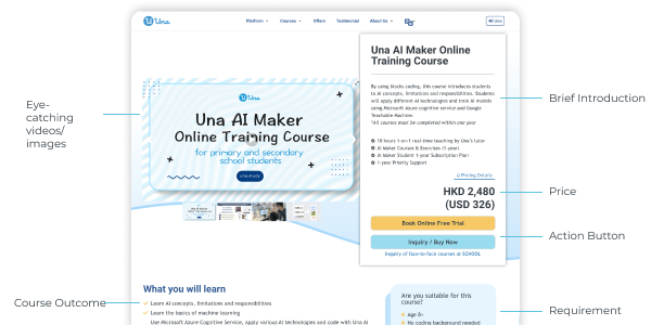
The first content section gives users the most important informations, include course highlight, brief introduction and price, etc. Thus, they can understand the content of the course quickly, and push them to take action to book a trial lesson.
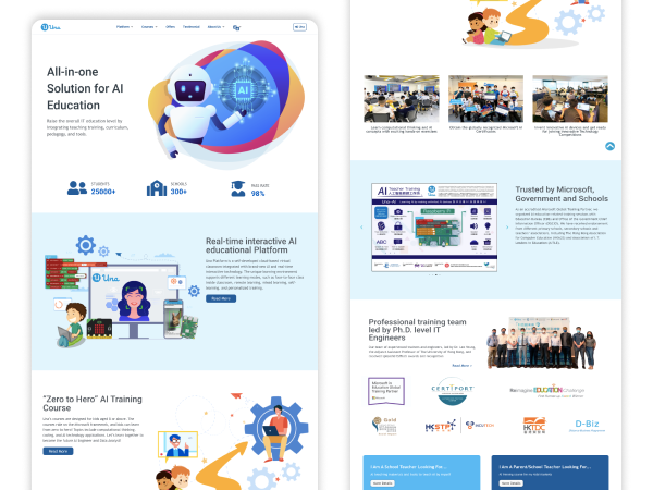
Una does not have an official homepage and the previous homepage was directly linked to one of our main product page, users may difficult to get a brief overview of our company and products. Thus, a new homepage is created which includes few sections to shows the vision, popularity, main products and recognition of the company.
